Accent Palette
Accent Palette
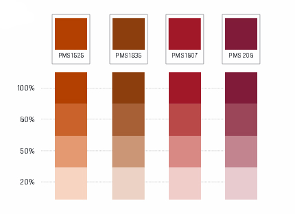
An expanded accent palette composed of Cyan, PMS 123, dark blue and gold, warm and cool colors has been selected to complement the Kent State primary colors. These can be used at any screen value, as colors may vary when used on different colors and/or textures of paper stock (uncoated, matte, gloss, etc.). The screen values shown are recommended.
These colors can be used no more than 20 percent in any given communication. These colors are to be used with the primary colors for highlighting and adding visual appeal.

Warm Palette

Cool Palette

Neutral Palette
The following neutral colors are appropriate backgrounds on printed and Web applications, in addition to paper white. (Black cannot be used as a background color on the Web.) These colors can also be used as accent colors, in addition to the accent colors shown above.

