
Operable Solutions
Operable solutions focus on correct presentation of TIMED content and clear NAVIGATION. These guidelines are very relevant for marketing, covering the crucial issues of flashing content, purposeful link names, headings, and lists.
Learn more about WCAG's Operable Principle
VISUALLY-SAFE, USER-CONTROLLED CONTENT
DEFINITION
WCAG states that "for any moving, blinking or scrolling information that (1) starts automatically, (2) lasts more than five seconds, and (3) is presented in parallel with other content, there is a mechanism for the user to pause, stop, or hide it. To avoid seizures or physical reactions, content should not contain more than three flashes per second."
TIPS
- If you present moving content, the user must be able to control playback - even on social media.
- Applies to videos, image carousels and even images that zoom or change perspective.
- When considering creating safe, non-seizure inducing content, don't assume that a warning at the beginning will guarantee compliance.
TESTING THE PAUSE, STOP, HIDE REQUIREMENT
On a page with moving or scrolling content, all of the following must be possible to meet this criterion.
- Check that a mechanism is provided in the Web page or user agent to pause moving or scrolling content.
- Use the pause mechanism to pause the moving or scrolling content.
- Check that the moving or scrolling has stopped and does not restart by itself.
- Check that a mechanism is provided in the Web page or user agent to restart the paused content.
- Use the restart mechanism provided to restart the moving content.
- Check that the movement or scrolling has resumed from the point where it was stopped.
real-world application
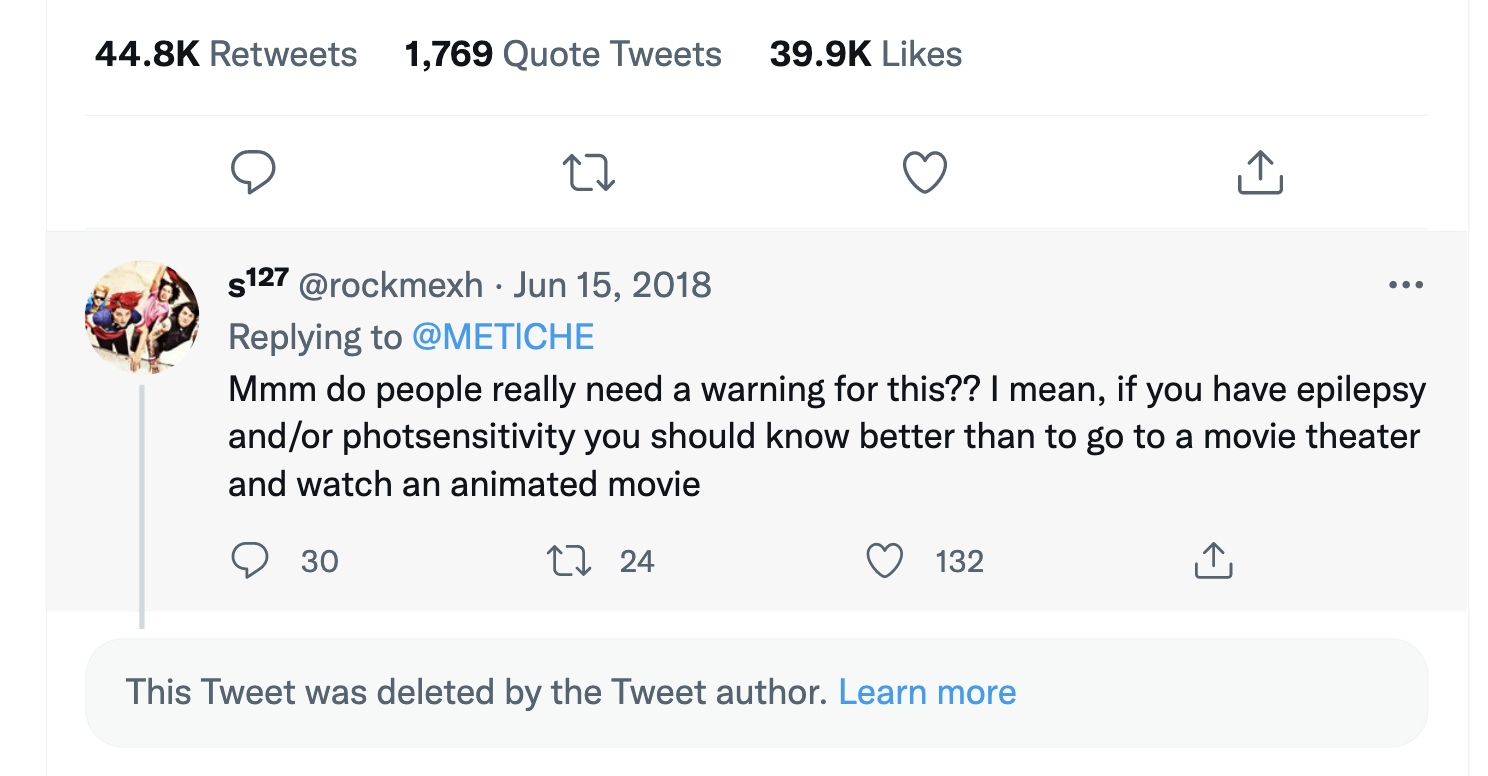
When a viewer went to see the movie Incredibles 2 in the theater, they were shocked by how problematic certain scenes would be for their photosensitive friends. Click the first image below for the original tweet.
NOTE: read the first shown comment on this tweet to see bias in full display - the commenter thinks if you're photosensitive you shouldn't have equal access to movie theaters. The correct attitude is to make the entertainment fully accessible so that all have access.

PURPOSEFUL LINK TEXT
DEFINITION
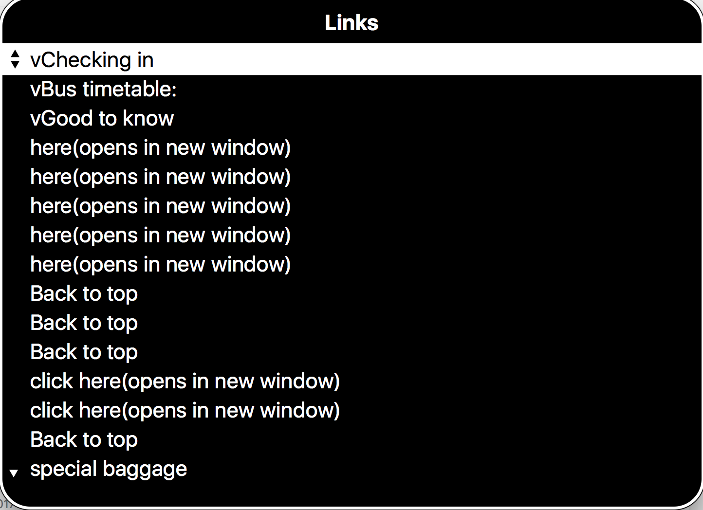
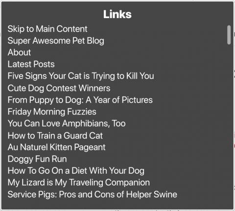
Avoiding common, non-descriptive link text such as "read more", "click here" or "click for details". The link's purpose must be obvious without its surrounding context. This helps users find the content they are looking for and differentiates links when read as a list by screen readers.
tips
- Get creative but be concise. Best practice is usually no more than 60 characters for a link text.
- Consider putting links inside a descriptive sentence: "Metro riders found the new INTERACTIVE MAP feature useful when planning their commute."
- On the other hand, do not get creative with standard website features that users will be looking for: Contact Us, FAQ, Help, Search, etc.
examples
Compare the two link lists below to understand the value in clearly labeled links:
HEADINGS
DEFINITION
Headings provide structure to content, allowing users to get to their desired content more quickly and ensuring assistive technology can navigate effectively. Headings are created in the same way as a document outline: the title (heading 1) used once, most significant content labeled by heading 2, subpoints of heading 2s marked as heading 3, etc.
tips
- Headings are rarely found in social media posts but should always be present in informative webpages, PDFs, and lengthy emails.
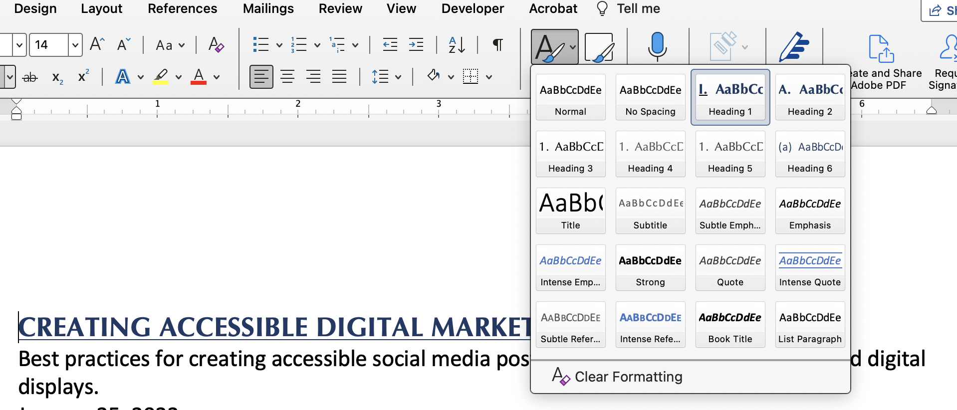
- Headings can be accessed in the "Styles" pane of email and document programs.
- Headings do NOT need to override chosen fonts or sizing. Right-click on any heading style in the pane of in Microsoft Office programs to see the option "Update heading to match selection". Clicking this will retain your stylistic choices while also designating this as a heading for screen readers.
examples
These screenshots will help you identify where the Styles/Headings options are in Microsoft Office products. 

LIST BEST PRACTICES
DEFINITION
Use a list to organize information by ideas or processes. Often a list is easier to understand than the same concepts within a paragraph but it is crucial to use NATIVE FUNCTIONS to designate lists - bullets and numbers. Again, assistive technologies will understand bullets and numbers much better, but the benefits extend to better visual layout as well.
tips
- Do not rely on tabbing or the space bar to create indents and visually mark a list. Assistive technology will not process this information well and your formatting will not remain constant in different programs or even different versions of the same program.
- Use bullets when the order of items DOESN'T matter
- Use numbers when the order DOES matter
examples
Study the following examples to understand the formatting benefits of bullets rather than tabbed/spaced indents.

