Color Contrast in Microsoft - Mac
Using color thoughtfully in course materials is about making your content accessible to all students, including those with visual impairments or color blindness. Some color choices can make important information hard to read or completely invisible to some students. By designing with accessibility in mind, you create materials that engage everyone and support learning.
This guide explores tips and steps for how to ensure proper color contrast and readability in Microsoft on Mac.
Quick Tips
- Use high-contrast colors
- Never rely on color alone to communicate meaning
- Add bold, underline, or icons to reinforce important content
- Run Check Accessibility before sharing your document
How to Ensure Strong Contrast
Guidelines
- Normal text: Minimum contrast ratio 4.5:1
- Large text (18pt or 14pt bold+): Minimum contrast ratio 3:1
Step-by-Step to Fix Contrast in Word
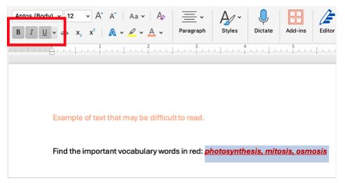
- Select the text that is hard to read.
- Go to Home → Font Color.
- Choose a darker color or use black for maximum contrast. Or, check the box for High Contrast Only.

Avoid Use of Color Alone to Convey Meaning
Bad Example (Color Only):
Find the important vocabulary words in blue: photosynthesis, mitosis, osmosis.
Good Example (Multiple Cues):
Find the important vocabulary words: photosynthesis✅, mitosis✅, osmosis ✅ (bold + blue + underline + symbol)
Step-by-Step Fix
- Highlight the important words.
- Go to Home → Bold and/or Underline.
- Optionally, keep the color for extra emphasis.
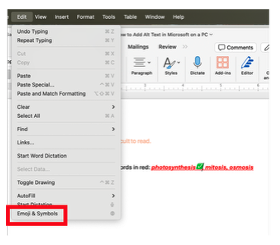
- Add an icon if needed: Edit → Emojis & Symbols → ✅
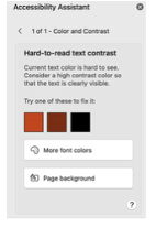
Use Word's Check Accessibility Tool
Word can automatically check your document for accessibility issues, including color contrast.
Step-by-Step:
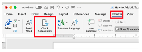
- Go to Review → Check Accessibility.
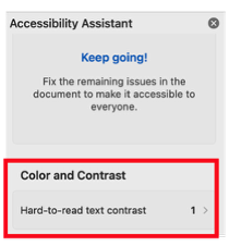
- The Accessibility Assistant panel appears on the right.
- Look for warnings under Color and Contrast.
- Click on each warning to see how to fix it.
- Re-run the check to confirm all issues are resolved.
Conclusion
Thoughtful use of color in Word helps ensure all students can access and understand your materials, not just those who can perceive certain colors. By following these best practices—using high contrast, reinforcing meaning with multiple cues, and leveraging the Accessibility Checker—you can create inclusive, engaging, and professional course documents.