Color Contrast in Canvas
Using color thoughtfully in course materials is about making your content accessible to all students, including those with visual impairments or color blindness. Some color choices can make important information hard to read or completely invisible to some students. By designing with accessibility in mind, you create materials that engage everyone and support learning.
This guide explores tips and steps for how to ensure proper color contrast and readability in Canvas.
Quick Tips
- Use high-contrast colors
- Never rely on color alone to communicate meaning
- Add bold, underline, or icons to reinforce important content
- Run Canvas Accessibility Checker before sharing your content
How to Ensure Strong Contrast
Guidelines
- Normal text: Minimum contrast ratio 4:5:1
- Large text (18pt or 14 pt bold+): Minimum contrast ratio 3:1
Step-by-Step to Fix Contrast in Canvas:
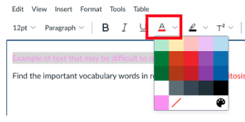
- Select the text that is hard to read.
- Open the Font Color menu.
- Choose a darker color or use black for maximum contrast.
- Preview your change on a white background.
Avoid Using Color Alone to Convey Meaning
Bad Example (Color Only):
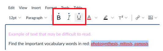
Find the important vocabulary words in blue: photosynthesis, mitosis, osmosis.
Good Example (Multiple Cues):
Find the important vocabulary words: photosynthesis, mitosis, osmosis
Step-by-Step Fix:
- Highlight the important words.
- Choose Bold, Italics and/or Underline from the menu.
- Optionally, keep the color for extra emphasis.
Use the Canvas Accessibility Checker
Canvas can automatically check your document for accessibility issues, including color contrast.
Step-by-Step:
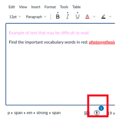
- Go to the Accessibility Checker from the bottom of the Rich Content Editor. If the page has identified errors in accessibility, it will indicate the number of issues.
- The Accessibility Checker panel appears on the right with the identified issues and recommended solutions. For example, choose a different color to ensure contrast. Choose Apply.
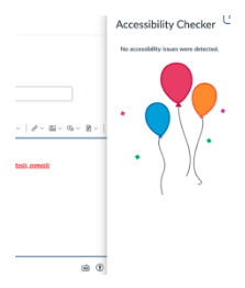
- Once completed, the Accessibility Checker will indicate that there are no accessibility issues detected.
- Be sure to Save or Save & Publish at the bottom of the page to preserve changes.

Conclusion
Thoughtful use of color in Canvas helps ensure all students can access and understand your materials, not just those who can perceive certain colors. By following these best practices—using high contrast, reinforcing meaning with multiple cues, and leveraging the Accessibility Checker—you can create engaging and professional course content.