
Card Optional Selector - Icon Cards

To use the Card Optional Selector - Icon Cards element in the Admissions Theme as shown in the image above, follow these directions:
- Create an Internal Basic Page (IBP) for each tile you want.
- The Title, Body, Media (icon), and Teaser Link will appear on the icon card.
- Go to the page where you want to add the Icon Cards element.
- Click on the Edit button (located under “Open Utilities” in view mode).
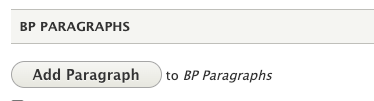
Scroll to the BP Paragraphs and select Add Paragraph.
- The Add Paragraph window will open.
- Select Card Optional Selector from the list.
Go to the Style Selector dropdown and choose Icon Cards. There are several different styles to choose from (Blue Overlap, Gold Overlap, etc.)

- Scroll to the Background Image section and click “Add media” to upload a photo.
- In the Cards field, enter the node IDs of the IBPs you created.
You may add more node IDs by clicking Add another item.
